Packaging


2021
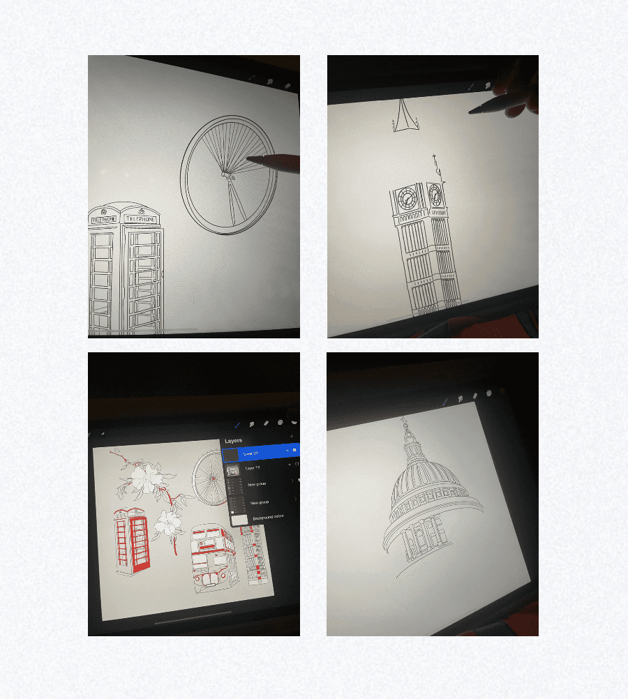
Experimental packaging design as a brief to celebrate the brand's 100th anniversary. The visuals were primarily inspired by the origins of the brand being from England and celebrating its roots. Each secondary packaging’s visuals represent different aspects of it from its famous locations, things, and people.
Concept
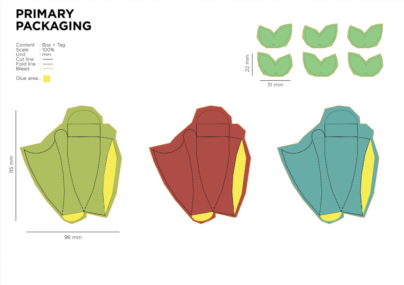
Having a consistent theme derived from Twining’s flower tea flavors, the primary resembles petals of each flower of the secondary packaging.




Concept
The tertiary also follows with it being a picnic basket that can unfold easily for quick access. Solving one of tea packaging’s biggest problem, the packaging offers solution by having tea tags people can hang from their mugs instead of worrying of it falling in the water. Not only that, but the innovative design from the primary to tertiary packaging stands out from the others
Process
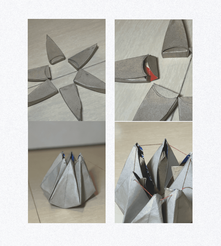
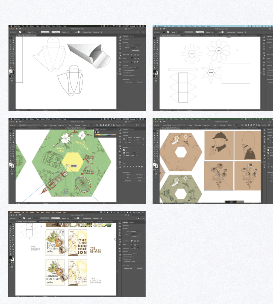
I knew I wanted the packaging's shape to be unusual to catch attention. From there I had the idea similar to blooming boxes and combined it with solving the problem in tea packagings. Making the dieline has to be one of the hardest parts since there is no existing template, and getting the measurements right was a struggle. Though after a lot of trials and redoing I’ve gotten a lot more familiar with the packaging’s mechanism in order for it to function properly.